Four Essential Features on Your Restaurant Website

by Joe Sainz
Creating your restaurant’s website is an important step to marketing your eatery–not only will the site act as a way for users to discover your restaurant, cuisine, and price point, but a good restaurant website should also act as a brief introduction into the overall ethos and vibe of your new restaurant. While restaurant websites may often include important features about your brand, back-story, best dishes, and more, there are four crucial parts to a restaurant’s website that every restaurateur should know. From a text-based menu, mobile-friendly navigation, on-site reservation integration, and location information clearly visible on every page, there are a number of critical steps for one of your most active pieces of digital marketing.
Text-Based Menu
Chief among all of the issues that many restaurateurs face in creating their restaurant website is the restaurant menu itself. As many restaurants are required to create PDFs of their physical menu prior to moving into production, often, webmasters see this as convenient shortcut, and simply drop the PDF into the site so potential diners can feast their eyes on all your eatery has to offer.
However, a PDF menu is a cardinal UX sin. “While it may be a quick solution for the web designer, PDFs are quite frustrating for visitors. Why should someone be required to download a file to their computer, just to glance over a menu?” argue the folks over at Web Designer Depot. Generally, they’re not alone. Forcing a user to download a file simply to view your menu disrupts the look and flow of the site, can often slow down the site’s Page Speed, and negates a number of new ways to maximize SEO value. Instead, create an HTML version of the menu, and use structured data and Schema markup to ensure the menu is effective in its display, and appropriately highlighted for Google and other search engines.
Even Google lauds the importance of using structured data and Schema.org to mark-up important HTML elements for your restaurant, as it will help Google “present your data more attractively — and in new ways — in search results and in other products.”
Mobile-Friendly Navigation
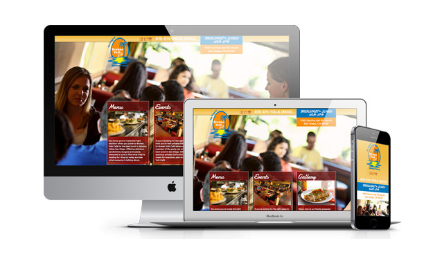
This should come as no surprise, especially since as of 2014, mobile usage has overtaken desktop usage in terms of Internet access, but a mobile-friendly design is now absolutely critical. Many restaurant goers will be looking for restaurants and eateries while on-the-go. These potential diners are incredibly motivated to make a purchase, and lean heavily on the mobile experience to make their decision.
The fine folks over at Toast highlight the need for a responsive or at least a mobile-friendly presentation of the website: They note that based on a recent study, nearly half of the visitor sessions to restaurant websites occurred on a mobile device, and over-half of these sessions started with a Google search. Furthermore, these searchers are ready to act, often visiting a location and making a purchase within a day of searching. “Those people searching for a restaurant, or even searching specifically for your restaurant, are highly motivated customers.”
Neglecting this as a priority can be costly for attracting new diners. Try approaching your site design by considering how it will appear across mobile devices first. Grow the vision of your restaurant website from the handheld display all the way out to the desktop display to create a portal for your restaurant that resonates at every resolution.
On-Site Reservations
Online reservations have been pretty much cornered by industry-leader OpenTable, but whatever restaurant reservation plugin you choose to use, it’s no question that an online reservation platform offers incredible incentive for users to go straight from discovery to dining room table.
Consider implementing a plug-in like this on your site so that users can immediately convert. Being able to comfortably identify when you can come in to experience a restaurant’s cuisine is an incredible convenience for potential customers, and an intuitive, non-obstructive way to go from a curious customer to a commitment.
Contact Info Everywhere
Lastly, one mistake that restaurants may make online is to only include their address and phone number on the contact page. Instead, make sure this information is clearly identifiable on every single page of your website. “Contact information — telephone, fax, and/or email — should be visible on every page of the website,” echoes Web Designer Depot. “It’s a good idea to place it near the top of the website, where it can be quickly accessed, especially on mobile devices. A plain-text phone number should be used so that on phones, it can be clicked to initiate a call.”
Go even further. Embed a Google map to highlight your restaurant’s location so users can literally visualize where to find your business. Use LocalBusiness Schema.org markup to ensure that the restaurant’s name, address, phone number, and other contact info is appropriately marked up to help Google identify the most important pieces of information.
Recent Posts

SEO Restaurants: How To Get Your Restaurant On Page 1 Of Google
December 18, 2016

SEO For Restaurants and Good Reviews: What You Need To Know
December 18, 2016

Restaurant Menu Psychology: What You Need To Know
December 18, 2016
